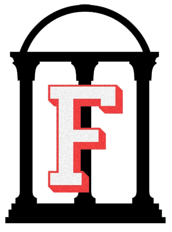
The Arch
Our Iconic SymbolThe Arch has been our most visible symbol for more than 150 years.
The Arch has been our most visible symbol for more than 150 years.
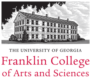
The shield invokes both our academic excellence and our community. It contains and protects the entity of the Arch.
UGA was founded as the first state-chartered university in 1785. The date is an important signifier of our long-standing commitment to public higher education.
A lot is happening at UGA — we’re solving global problems. Improving human lives. Making a commitment to the future of Georgia and to a better world. It’s time for our visual identity to reflect our commitments.
The public phase of the comprehensive capital campaign launches in Fall 2016! It is important to have a strong and consistent visual identity so our partners, donors and alumni can easily recognize our institution’s full impact and are motivated to strengthen their support. In addition, this refreshed logo harkens back to the history and pride of the original logo and presents an updated look that will work better across today’s media formats.
To date, colleges, schools, units and divisions across the university have had a variety of different presentations, using different colors, fonts and approaches. Our visual system is intended to align us across the institution to be stronger as a whole.
The variety of logos in August 2016:


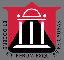


Designed with purpose (and a lot of late nights), each element of the updated logo has been thoughtfully crafted to present an ambitious face.
Refreshing our visual identity will not only create a future-facing aesthetic, but it will also create a strong, unified look and feel across the entire university for the comprehensive capital campaign. We’ll have better consistency, clarity and brand recognition thanks to a unified color palette and graphic system.
The identity will work synergistically across every channel, building recognition and bringing us together. Athletics and academics will be aligned, creating impact and energy.
Schools and departments will enjoy cost savings and fewer headaches as they won’t have to invest time and money into creating their own independent logos. Guidelines and resources will be provided for teams across the institution.
The previous logo was introduced back in the 1980s when social media and other digital formats were not critical channels of communication and there was no need for a logo to be screen-friendly.
Today, much of our communications are through digital channels, such as social media and apps, that didn’t exist in 1989 when our previous logo was created, or in 1996 when it was adjusted to accommodate “recycled papers, email addresses, fax numbers, and other innovations unforeseen in 1989.” Logos used in digital mediums require stronger lines and a bolder design, which have been used in the updated logo.
Months of research and development went into bringing the refreshed identity to life as we prepare for the public phase of the comprehensive capital campaign. We built on existing data, reviewed dozens of other university systems and partnered with Development, Alumni Relations and the faculty of the Lamar Dodd School of Art to begin the process. But we didn’t stop there. We listened to students, faculty, staff and alumni leadership to gather feedback and make refinements. We explored a variety of options and reviewed countless variations to get it just right.
Nearly 260 people — staff, students, alumni and faculty — attended one of 25 well-publicized listening sessions and talked about their needs for a logo system and their preferences for the elements that would appear in a refreshed logo. We are especially grateful to the faculty of the design department of the Lamar Dodd School of Art, whom we consulted several times during the project.
Yes, we spoke to alumni in focus groups. We also conducted telephone interviews with alumni leaders across the country.
Yes, we met with key graphic design faculty at the Lamar Dodd School of Art for insights throughout the process. Several faculty members attended the public listening sessions.
Few universities have a single visual brand identity that is used for both athletics and academics. We wanted to update the University of Georgia’s institutional logo to represent the achievements, reputation, and aspirations of the entire university. Athletics will continue to use the Georgia Athletics visual brand identity for athletic-related communications.
There was tremendous inconsistency across campus, at the school and unit level, for the use of ‘The,’ so we knew we needed to take a stand to obtain consistency. We looked at the university’s charter and found that it did not provide a precedent for the capital “T” — “The.”
All of the colleges, schools and administrative units have received their primary logos and are continuing to define their logo needs for all of their sub-units and programs. A comprehensive visual identity system is being developed including guidelines for the use of all logos and should be ready in the next few weeks. Throughout the fall, logos will be delivered and they can begin being used. It will take many months to roll out, as we are directing the university to continue being a good steward of the resources and to use all existing materials before reordering any new material with the refreshed logo.
The updated university logo will first be seen as the closing image in the university’s PSA that airs during our football games. Plans are being made to begin using it on the web and in social media — those are no-cost and low-cost changes. The updated logo will be used on orders of letterhead and business cards that are placed after September 6 with our campus partner, Bulldog Print + Design. Again, we are directing the university to continue being a good steward of the resources and to use all existing materials before reordering any new material with the refreshed logo.